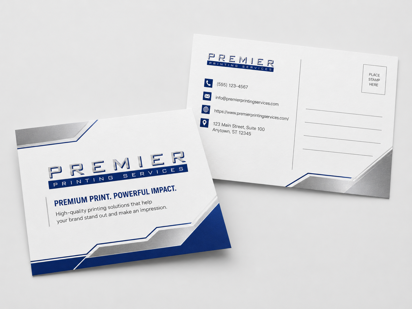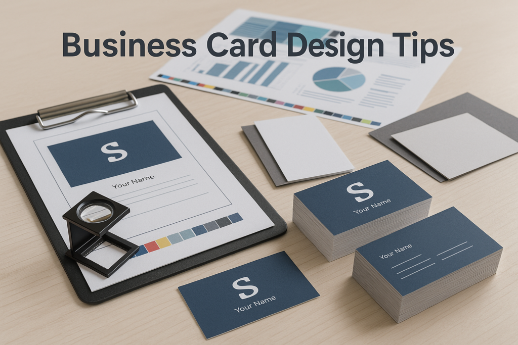
A business card is small, but it carries a lot of responsibility. It has to share your contact information, support your brand, feel professional, and be easy to use after a meeting, event, estimate, or sales call.
Good business card design tips are not just about making the card look nice. They are about making smart choices before the card goes to print, so you avoid hard-to-read text, awkward trimming, low-resolution logos, and paper choices that do not match how the card will be used.
If you are getting ready to order business card printing for one person or an entire team, the following tips will help you prepare a cleaner, more reliable print project.
Start with the job your business card needs to do
Before you pick fonts, colors, or paper, decide what the card needs to accomplish. A card for a law firm may need to feel simple and formal. A card for a restaurant, salon, contractor, or creative agency may benefit from stronger visual personality. A sales team card may need a QR code, direct phone number, or appointment link.
Do not try to make one small card do everything. Your card should answer the basics quickly: who you are, what company you represent, how someone can reach you, and where they can learn more.
For small business teams building out more than business cards, it can help to think about your full print set together. Letterhead, envelopes, flyers, brochures, signage, and cards should feel related. If you are planning multiple materials, this business printing guide for small business teams is a useful place to start.
Business card design tips that improve readability
The most attractive business card still fails if someone has to squint to read it. Readability should drive the layout.
Keep the hierarchy clear
Most cards need a clear visual order. Your company name or logo, your name, your title, and your contact details should not all compete for attention at the same size and weight.
A simple hierarchy helps the eye move naturally across the card. For example, your logo might be the largest visual element, your name slightly smaller, and your phone, email, website, and address arranged in a clean group.
Use white space on purpose
White space does not have to be white. It simply means open space around design elements. It gives the card room to breathe and helps important details stand out.
One common mistake is trying to fill every corner with extra services, social handles, taglines, certifications, and promotional messages. If the card starts to feel crowded, move secondary content to your website, a QR code landing page, or a separate printed piece.
Be careful with small type
Small type can look acceptable on screen and still be hard to read in print. Thin fonts, light gray text, and tight spacing can make the problem worse.
If your audience includes customers who may be reading the card in a dim restaurant, at a busy trade show, or after a field appointment, choose clarity over style. Ask your printer to review the file if you are not sure whether the type is practical for production.
Make your brand recognizable without overloading the card
Your business card should feel connected to your brand, but it does not need to carry every brand asset you own. Use your logo, core colors, and a consistent font system where possible.
If your logo or photo looks fuzzy, stretched, or pulled from a website, it may not print well. Before production, review this guide on what makes a logo or photo suitable for high-quality print production. It explains why file type, resolution, and image quality matter.
If your company does not have consistent branding yet, business cards can expose that quickly. A print shop with design support can help clean up spacing, rebuild artwork, or create a more consistent look across your printed materials. Premier also offers guidance around custom graphic design and full company branding when you need more than a quick file check.
Choose paper stock and finishes based on use
Paper affects how a business card feels before anyone reads it. A heavier stock can feel more substantial. A smooth finish may support a clean corporate look. A textured or uncoated stock may fit certain professional, creative, or hospitality brands.
There is no single best paper for every company. Think about how the card will be used. Will people write appointment times on it? Will it be handed out at networking events? Will it sit inside a presentation folder? Will the design use dark solids, photography, or lots of white space?
Finishing choices can also affect the final impression. Matte, gloss, soft-touch, spot UV, rounded corners, foil, embossing, or other specialty options may be available depending on the project and production method. Availability, cost, and suitability can vary, so confirm options with the print shop before finalizing your design.
If you are unsure where to start, this article on how to pick the right paper stock gives a helpful overview of paper considerations for print projects.
Set up the file correctly before printing
Many business card problems are not design problems at first. They are file setup problems. A card can look perfect on screen and still create issues if the file does not include proper bleed, safe margins, color settings, image quality, or fonts.
Before you send artwork to print, review the Premier Pre-Press Toolkit. It can help you prepare files and understand the kinds of details a prepress team checks before production.
Watch bleed, trim, and safe areas
If your background color, photo, or design element runs to the edge of the card, the artwork generally needs bleed. Bleed gives the printer extra image area beyond the final trim size, helping prevent unwanted white slivers at the edge.
Important text and logos should also stay inside a safe margin. Trimming can vary slightly in normal production, so do not place critical details right against the edge. For a deeper explanation, read this guide to bleed, trim, and safety margins in printing.
Check resolution and color
Logos, headshots, and background images should be suitable for print, not just web use. Low-resolution images may look blurry or pixelated once printed.
Color can also shift between your monitor and the final printed piece. Screens use light, paper uses ink or toner, and every paper stock reacts differently. A proof helps catch obvious issues, but it is still smart to ask questions before production if color accuracy is important.
Submit the right file type
Print shops often prefer press-ready PDF files, but requirements can vary by project and workflow. If your card includes special finishes, variable names, QR codes, or multiple employee versions, ask what file format and naming structure your printer prefers.
For larger teams, it is also worth organizing employee information carefully before design begins. A spreadsheet with names, titles, phone numbers, emails, office addresses, and approval contacts can save time and reduce mistakes.
Common business card design mistakes to avoid
Business cards are simple, but small errors are easy to miss. Some of the most common issues include overcrowded layouts, missing bleed, outdated contact information, low-quality logos, weak contrast, and inconsistent branding between employees.
QR codes are another area to check carefully. If you include one, make sure it is large enough to scan, has enough contrast, and points to the correct page. Test it from a printed proof or sample if possible, not only from your screen.
Also watch for cards that look good individually but create problems across a team. If each employee card uses different spacing, title formatting, phone number style, or email capitalization, the set can feel less professional. Templates help keep everyone consistent.
For more detail, Premier has a separate guide on business card printing mistakes to avoid.
Plan your timeline with proofing in mind
Business card orders can feel urgent, especially when a new hire starts, a trade show is coming up, or a sales team runs out of cards. Still, it is better to build in time for proofing than to rush a file with errors.
Proofs are your chance to check spelling, phone numbers, addresses, QR codes, logo placement, and overall layout. Have the right person review the proof. If legal, compliance, HR, or a department manager needs to approve employee titles or office locations, include them early.
Turnaround can depend on quantity, paper, finishing, proof approval, and the printer’s production schedule. If you have a firm event date or meeting deadline, share it when requesting a quote so the print team can guide you toward practical options.
When to ask your printer for help
You do not need to solve every design and production question alone. A professional printer can often spot problems before they become expensive or frustrating.
Ask for help if your logo looks soft, your card has edge-to-edge color, you are using specialty finishes, you need cards for multiple employees, or you are not sure whether your file is print-ready. It is also smart to ask before ordering if you are matching cards to existing stationery or other branded materials.
Small businesses and office teams that print regularly may benefit from a more organized ordering process. Premier offers small business printing support and business-focused print services that can help keep materials consistent across departments, locations, or recurring orders.
Use these business card design tips before you request a quote
The best business card design tips come down to a few practical habits: keep the layout readable, use strong brand assets, choose paper thoughtfully, prepare the file correctly, and leave time for proofing. Those steps help your card look professional and reduce avoidable production issues.
If you are ready to print business cards or want a print professional to review your design, contact Premier Printing Services for more information or project help.